Data Visualisation
More Stunning Infographics and Data Visualization
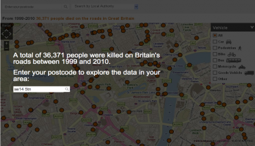
Britain has one of the best records in the world for road casualties. However, hundreds still die on the roads every year. In 2010, the police recorded 1,850 deaths, 22,660 people seriously injured and 184,138 who received light injuries.
About the map: Using official data recorded by police in Great Britain between 1999 and 2010, we have plotted every road collision in which someone died. In all, 36,371 fatalities are marked on this interactive map. You will also find partial data for Northern Ireland, for 2004-2009.
How the data is gathered: Detailed information about each crash is recorded by the police at the scene. It is subsequently transferred onto a computer database. This is available to researchers from the Economic and Social Data Service.
Missing data: As with any large collection of data, there will be errors and omissions. The BBC apologises for any distress or offence that may be caused by the inclusion of these errors. If you find any errors, please use the feedback form and let us know. We will endeavour to correct them where possible.
Bbc News Data
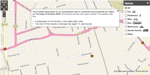
Explore Your Area
Rayz Ong, a student from Singapore created this data visualization called 37Min Busride. He created this by taking a 174 bus in Singapore from Buukit Batok to Orchad Road. The bus stoped at 33 stops. During this whole journey Rayz Ong recorded the number of passengers that had boarded the bus, the races of the people who got on the bus, gender, age group and whatever else he could use from the passengers. Using Graphic Design he converted his data in to a visually stimulating design from a short journey of 37 minutes. He has created many more visualizations, animations and video all using the same collected data.
37
Min Busride
This visualization is the result of a personal web research by Quentin Delobel about Josef Müller-Brockmann and the international typographical style. It contains 3 key elements:
1) The research of information on the web
Chronological information on Josef Müller-Brockmann’s life,
2) The Swiss style and major themes of the history of design during the 20th century found (found during key element 1)
3) Finally the last part is composed of a critical article based on information found online.
Josef Müller-Brockmann’s Visualization
Tech City Map is a constantly-evolving compendium of East London's vibrant technology and creative ecosystem. In addition to showing where businesses are located Tech City Map uses advanced technology from Trampoline Systems to reveal the web of connections linking them together and calculate each company's influence in the community.
The platform works by pulling in streams of Twitter data from each business and tracking following relationships, mentions and retweets.
It was launched by UK Prime Minister David Cameron in November 2011 at the Trampery in Shoreditch, East London.
Tech City
One of East London's great strengths is its inter-disciplinary creative community. Software businesses mix with film-makers, fashion designers, digital media agencies, artists and product designers. The jostle of ideas from all these tribes is a tremendous driver for innovation. Tech City Map sets out to capture all the different dimensions and reveal the mesh of connections between them.